Последние комментарии
- DxB-studio

Оставлен 01.01.2015
Стильное оповищение Войти или зарегестрироватся для ucoz - DxB-studio
Оставлен 29.11.2014
o2 Reborn Ultimat для uCoz (ЕСТЬ ДЕМО) - Qston.3dn.ru

Оставлен 04.09.2014
Аватары в личных сообщениях - Cat
Оставлен 13.07.2014
Сворачиваемый мини-чат для ucoz - Владимир
Оставлен 07.07.2013
Форма регистрации для uCoz - ugames7
Оставлен 21.04.2013
Оригинальный шаблон для uCoz
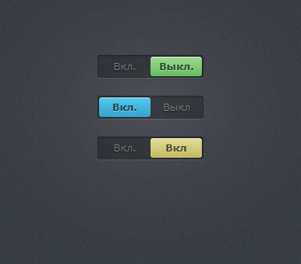
Красивые Radio кнопки построенные на CSS3.
Установка:
1 шаг. Это ставим там где нужно:
Code
<div class="switch">
<input type="radio" class="switch-input" name="view" value="on" id="on" checked>
<label for="on" class="switch-label switch-label-off">Вкл.</label>
<input type="radio" class="switch-input" name="view" value="off" id="off">
<label for="off" class="switch-label switch-label-on">Выкл.</label>
<span class="switch-selection"></span>
</div>
<div class="switch switch-blue">
<input type="radio" class="switch-input" name="view2" value="on2" id="on2" checked>
<label for="on2" class="switch-label switch-label-off">Вкл.</label>
<input type="radio" class="switch-input" name="view2" value="off2" id="off2">
<label for="off2" class="switch-label switch-label-on">Выкл</label>
<span class="switch-selection"></span>
</div>
<div class="switch switch-yellow">
<input type="radio" class="switch-input" name="view3" value="on3" id="on3" checked>
<label for="on3" class="switch-label switch-label-off">Вкл.</label>
<input type="radio" class="switch-input" name="view3" value="off3" id="off3">
<label for="off3" class="switch-label switch-label-on">Вкл</label>
<span class="switch-selection"></span>
</div>
2 шаг. Это ставим в CSS:
Code
.switch {
position: relative;
height: 26px;
width: 120px;
margin: 20px auto;
background: rgba(0, 0, 0, 0.25);
border-radius: 3px;
-webkit-box-shadow: inset 0 1px 3px rgba(0, 0, 0, 0.3), 0 1px rgba(255, 255, 255, 0.1);
box-shadow: inset 0 1px 3px rgba(0, 0, 0, 0.3), 0 1px rgba(255, 255, 255, 0.1);
}
.switch-label {
position: relative;
z-index: 2;
float: left;
width: 58px;
line-height: 26px;
font-size: 11px;
color: rgba(255, 255, 255, 0.35);
text-align: center;
text-shadow: 0 1px 1px rgba(0, 0, 0, 0.45);
cursor: pointer;
}
.switch-label:active {
font-weight: bold;
}
.switch-label-off {
padding-left: 2px;
}
.switch-label-on {
padding-right: 2px;
}
/*
* Note: using adjacent or general sibling selectors combined with
* pseudo classes doesn't work in Safari 5.0 and Chrome 12.
* See this article for more info and a potential fix:
* http://css-tricks.com/webkit-sibling-bug/
*/
.switch-input {
display: none;
}
.switch-input:checked + .switch-label {
font-weight: bold;
color: rgba(0, 0, 0, 0.65);
text-shadow: 0 1px rgba(255, 255, 255, 0.25);
-webkit-transition: 0.15s ease-out;
-moz-transition: 0.15s ease-out;
-ms-transition: 0.15s ease-out;
-o-transition: 0.15s ease-out;
transition: 0.15s ease-out;
-webkit-transition-property: color, text-shadow;
-moz-transition-property: color, text-shadow;
-ms-transition-property: color, text-shadow;
-o-transition-property: color, text-shadow;
transition-property: color, text-shadow;
}
.switch-input:checked + .switch-label-on ~ .switch-selection {
left: 60px;
/* Note: left: 50%; doesn't transition in WebKit */
}
.switch-selection {
position: absolute;
z-index: 1;
top: 2px;
left: 2px;
display: block;
width: 58px;
height: 22px;
border-radius: 3px;
background-color: #65bd63;
background-image: -webkit-gradient(linear, left top, left bottom, color-stop(0%, #9dd993), color-stop(100%, #65bd63));
background-image: -webkit-linear-gradient(top, #9dd993, #65bd63);
background-image: -moz-linear-gradient(top, #9dd993, #65bd63);
background-image: -ms-linear-gradient(top, #9dd993, #65bd63);
background-image: -o-linear-gradient(top, #9dd993, #65bd63);
background-image: linear-gradient(top, #9dd993, #65bd63);
-webkit-box-shadow: inset 0 1px rgba(255, 255, 255, 0.5), 0 0 2px rgba(0, 0, 0, 0.2);
box-shadow: inset 0 1px rgba(255, 255, 255, 0.5), 0 0 2px rgba(0, 0, 0, 0.2);
-webkit-transition: left 0.15s ease-out;
-moz-transition: left 0.15s ease-out;
-ms-transition: left 0.15s ease-out;
-o-transition: left 0.15s ease-out;
transition: left 0.15s ease-out;
}
.switch-blue .switch-selection {
background-color: #3aa2d0;
background-image: -webkit-gradient(linear, left top, left bottom, color-stop(0%, #4fc9ee), color-stop(100%, #3aa2d0));
background-image: -webkit-linear-gradient(top, #4fc9ee, #3aa2d0);
background-image: -moz-linear-gradient(top, #4fc9ee, #3aa2d0);
background-image: -ms-linear-gradient(top, #4fc9ee, #3aa2d0);
background-image: -o-linear-gradient(top, #4fc9ee, #3aa2d0);
background-image: linear-gradient(top, #4fc9ee, #3aa2d0);
}
.switch-yellow .switch-selection {
background-color: #c4bb61;
background-image: -webkit-gradient(linear, left top, left bottom, color-stop(0%, #e0dd94), color-stop(100%, #c4bb61));
background-image: -webkit-linear-gradient(top, #e0dd94, #c4bb61);
background-image: -moz-linear-gradient(top, #e0dd94, #c4bb61);
background-image: -ms-linear-gradient(top, #e0dd94, #c4bb61);
background-image: -o-linear-gradient(top, #e0dd94, #c4bb61);
background-image: linear-gradient(top, #e0dd94, #c4bb61);
}
position: relative;
height: 26px;
width: 120px;
margin: 20px auto;
background: rgba(0, 0, 0, 0.25);
border-radius: 3px;
-webkit-box-shadow: inset 0 1px 3px rgba(0, 0, 0, 0.3), 0 1px rgba(255, 255, 255, 0.1);
box-shadow: inset 0 1px 3px rgba(0, 0, 0, 0.3), 0 1px rgba(255, 255, 255, 0.1);
}
.switch-label {
position: relative;
z-index: 2;
float: left;
width: 58px;
line-height: 26px;
font-size: 11px;
color: rgba(255, 255, 255, 0.35);
text-align: center;
text-shadow: 0 1px 1px rgba(0, 0, 0, 0.45);
cursor: pointer;
}
.switch-label:active {
font-weight: bold;
}
.switch-label-off {
padding-left: 2px;
}
.switch-label-on {
padding-right: 2px;
}
/*
* Note: using adjacent or general sibling selectors combined with
* pseudo classes doesn't work in Safari 5.0 and Chrome 12.
* See this article for more info and a potential fix:
* http://css-tricks.com/webkit-sibling-bug/
*/
.switch-input {
display: none;
}
.switch-input:checked + .switch-label {
font-weight: bold;
color: rgba(0, 0, 0, 0.65);
text-shadow: 0 1px rgba(255, 255, 255, 0.25);
-webkit-transition: 0.15s ease-out;
-moz-transition: 0.15s ease-out;
-ms-transition: 0.15s ease-out;
-o-transition: 0.15s ease-out;
transition: 0.15s ease-out;
-webkit-transition-property: color, text-shadow;
-moz-transition-property: color, text-shadow;
-ms-transition-property: color, text-shadow;
-o-transition-property: color, text-shadow;
transition-property: color, text-shadow;
}
.switch-input:checked + .switch-label-on ~ .switch-selection {
left: 60px;
/* Note: left: 50%; doesn't transition in WebKit */
}
.switch-selection {
position: absolute;
z-index: 1;
top: 2px;
left: 2px;
display: block;
width: 58px;
height: 22px;
border-radius: 3px;
background-color: #65bd63;
background-image: -webkit-gradient(linear, left top, left bottom, color-stop(0%, #9dd993), color-stop(100%, #65bd63));
background-image: -webkit-linear-gradient(top, #9dd993, #65bd63);
background-image: -moz-linear-gradient(top, #9dd993, #65bd63);
background-image: -ms-linear-gradient(top, #9dd993, #65bd63);
background-image: -o-linear-gradient(top, #9dd993, #65bd63);
background-image: linear-gradient(top, #9dd993, #65bd63);
-webkit-box-shadow: inset 0 1px rgba(255, 255, 255, 0.5), 0 0 2px rgba(0, 0, 0, 0.2);
box-shadow: inset 0 1px rgba(255, 255, 255, 0.5), 0 0 2px rgba(0, 0, 0, 0.2);
-webkit-transition: left 0.15s ease-out;
-moz-transition: left 0.15s ease-out;
-ms-transition: left 0.15s ease-out;
-o-transition: left 0.15s ease-out;
transition: left 0.15s ease-out;
}
.switch-blue .switch-selection {
background-color: #3aa2d0;
background-image: -webkit-gradient(linear, left top, left bottom, color-stop(0%, #4fc9ee), color-stop(100%, #3aa2d0));
background-image: -webkit-linear-gradient(top, #4fc9ee, #3aa2d0);
background-image: -moz-linear-gradient(top, #4fc9ee, #3aa2d0);
background-image: -ms-linear-gradient(top, #4fc9ee, #3aa2d0);
background-image: -o-linear-gradient(top, #4fc9ee, #3aa2d0);
background-image: linear-gradient(top, #4fc9ee, #3aa2d0);
}
.switch-yellow .switch-selection {
background-color: #c4bb61;
background-image: -webkit-gradient(linear, left top, left bottom, color-stop(0%, #e0dd94), color-stop(100%, #c4bb61));
background-image: -webkit-linear-gradient(top, #e0dd94, #c4bb61);
background-image: -moz-linear-gradient(top, #e0dd94, #c4bb61);
background-image: -ms-linear-gradient(top, #e0dd94, #c4bb61);
background-image: -o-linear-gradient(top, #e0dd94, #c4bb61);
background-image: linear-gradient(top, #e0dd94, #c4bb61);
}
Посмотреть демо Radio CSS3
Другие новости |
Поделиться ссылкой
|

|